5 Common Gallery Wall Mistakes We See All the Time
Collecting artwork for your home is a personal reflection displaying your interests, memories, and inspirations. To create an artful arrangement, you want to make sure that your gallery wall is as distinct and dynamic looking as your art selection.
From cherry-picking your artwork and frames to plotting out your final display, gallery walls call for much preparation. To master the art of creating the perfect grouping, avoid making these common mistakes.
Mistake #1. Use Matchy-Matchy Frames
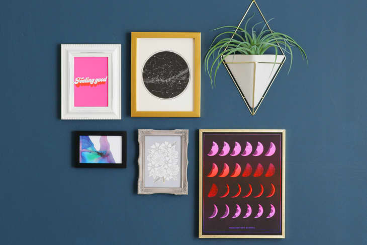
Frames shouldn’t be an afterthought. To give your lineup of images a collected look, you want to intermingle different finishes, shapes, and thicknesses. If the mounting for your artwork is the same size, shape and finish, your gallery wall will appear fussy and formal—and quite honestly, boring. So instead, incorporate a mix of metals, wood, and colors.
Just be sure to keep frames modest and simple. You don’t want to divert attention from your art with overly ornate trim. One dramatic border can easily steal the show and act as an eyesore rather than a part of the greater collection.
Mistake #2. Choose All the Same Size and Shape
Symmetry is important when composing a balanced gallery wall, but that doesn’t mean you need to use frames that are all the same size and shapes. A grid of identical shapes can look stiff and dull.
You can still create a sense of symmetry by grouping two or three frames of the same dimension with a range of shapes and sizes. For instance, pair of two 8-by-10s with a large poster. To further play with proportion, consider adding mats to a few select images.
Mistake #3. Display Just One Medium or Style
Think about why you visit art galleries and museums: It’s to expose yourself to a range of mediums, artists, and ideas. Take this approach with your at-home gallery. Juxtapose a black-and-white photograph with a colorful typographical print, or arrange a cluster of vintage silhouette cameos next to a quirky oil painting.
And, don’t feel confined to “art.” For added dimension and texture, incorporate decorative objects like a tribal mask, vintage license plate, funky mirror, tapestry, or wall-mounted antlers.
Mistake #4. Inconsistent Spacing Between Artwork
Art that is hung close together with frames butting up against one another looks sloppy and cluttered. You also don’t want so much space in-between each piece of art that the viewer is distracted by awkward blank spaces. Artwork should be hung close enough that pieces relate, but not so far apart that it looks like your prints are floating off into the great abyss that is your wall.
There should be just enough breathing room (three inches is a good rule of thumb) in between each image. And be consistent. Don’t hang some images with three inches of spacing and then others with six inches.
Mistake #5. Not Planning in Advance
While your gallery wall will span a good length and height of your wall, keep in mind that the center of the arrangement should be hung at eye level. And if you are hanging images above a couch or credenza, make sure there is at least 12 inches of space between furniture and frames.
Before you start pounding nails in the wall, draw a rough draft of your composition on a sheet of paper. Then if you want to take another step for accuracy sake—ensuring that scale and balance are squared away—map out your lineup of images with butcher paper, cutting out silhouettes and taping them to the wall. (Creating faux frames with painters tape also works well!) Leave the silhouettes up for a few days and see how your grouping looks. Feel free to change up the pattern if it just doesn’t feel right. Then once you feel like you’ve created a balanced gallery wall, hang your artwork.

