

The Color-Coding Hack that Saved Me from My Email Inbox, Boosted my Productivity, and Gave me Peace of Mind

As the year comes to a close, people everywhere are struggling to find some semblance of normalcy in a truly turbulent period. But many still have responsibilities that require them to be functional and productive on some level, and feeling like your focus is being pulled in every possible direction can do a number on your productivity. I know I’m not alone when I say that my focus has taken a hit.
For more content like this follow
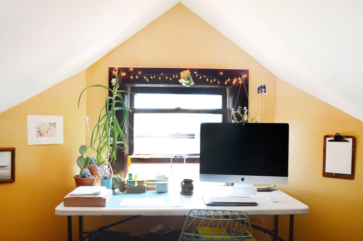
As someone who has worked from home her entire life, I’ve developed plenty of habits to keep myself motivated and on top of everything—but the habits that used to work for me are no longer available. I used to be able to drop by my neighborhood pilates center for a workout to boost my serotonin levels, or work in a coffee shop or library, which gave me a sense of community in the silence. Since the bulk of my work is done through my two best friends (Gmail and Google Drive), I had to find a way to manage my workload even when my mind feels like it’s on its last legs.
How I figured out what wasn’t working for me:
I’m one of those people who believe in “inbox zero” at the end of every single day, and my previous way of management in the Before Times was answering emails as they come. But now, when it feels like everything is coming at twice the normal speed, I find myself overwhelmed by the mass of communication coming at me from all angles.
I have avisual brainand am super affected by graphic cues. I realized that looking at my inbox every hour without any sort of real organizing system was adding more stress because of the monochromatic look of Google’s design.
To add some organization to my life, I came up with a sorting system that could help me prioritize what requires most of my bandwidth while appeasing to my visual needs.
How to use color theory for labelling:
The system I developed is a trick that I learned from a design course I took in college. We were learning aboutcolor theory,and how many people have natural associations with colors. For example, when we see red tones, we tend to associate very aggressive (and often negative!) things like a teacher’s red pen, or a “do not disturb” signal from Slack.
The subconscious hints we take from color hues have a massive effect on how we process information. (That’s why when you’re painting your bedroom walls, you might want to pick a color that’s soothing so your mind is able to relax.) When I open my inbox and I’m bombarded by emails, my natural inclination is to close my laptop. The default tech design is white, gray, and primary colors: these are the colors that we often associate with corporations (see: Google’s entire logo palette) and as someone who is more visually affected, I wanted to make my design more warm and personal.
The process is simple, but effective:Each time I open my email, I first look at any unread emails that have come my way since the last time I was in my inbox. I take five to ten minutes to sift through spam, and then quickly assess the rest of my mail: I decide what label it falls under, and how quickly I need to answer.
There are plenty of email hacks you can employ to make this system even easier. Here’s how I make color-coding work for me:
First: Organize by timeliness
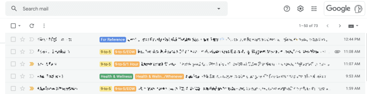
To start, I divided up my labels into four categories, all determined by time: “Respond Within Hour,” “Respond by EOD,” “Respond by EOW,” and “Respond When Possible.” All of my time labels are orange because it’s close enough to the urgency of red, but without the instinctive alarm that neon red sets off in our subconscious. Urgent, but not stressful.
I found that by relieving myself of the pressure of being constantly available, I was actually able to focus more. Experts have studied the positive effects ofsetting “office hours” for emailsand it’s been proven to improve efficiency, which I experienced firsthand. As much as I joke about emails being stressful because if you send one, you’ll suddenly get three more, it is very daunting and stressful when you’re trying to keep tabs of multiple conversations that all have varying degrees of urgency. By creating a time-based labelling system, I can focus on what needs priority and what can be looked at later in the day or week.
Second, coordinate based on the topic:
I started to add more labels based on the category of the email. This is done so I know at a glance which of my tasks I might be neglecting most at any given time. Here are the color labels that I’ve crossed based on my own needs:
Yellow: Work
According to color theory, yellow is the first color you notice. Since I primarily use my email for work-related things, I wanted an easy and immediate flag for all work-related correspondence.
Green: Health and Wellness
These are mostly therapy appointment reminders and other health related communications. I wanted the green to symbolize that I am living, breathing being that needs to be nurtured (or as my favorite tweet puts it:we’re all just house plants with more complicated emotions).
Blue: References
Blue is supposed to be soothing; I use it as my “reference” tab where I save newsletters and other emails that I can look at later if I’m in need of a mood-booster.
I avoid using two colors: red and purple, because they tend to spike stress sensors in the pupil. Certain colors have more aggressive associations, either just by saturation or by association (thanks to advertising), andexperts have studied which colors to avoidif you’re trying to de-stress yourself. Like the way most people wouldn’t paint their bedrooms bright red, you likely won’t want to look at the screen that’s dotted with red labels.
The results of color-coding my inbox:
Since I started color-coded my inbox, I have noticed a significant change in even just the anticipation of opening my email. I can visually see what needs my attention and when, and the system provides me with a plan for tackling my to-do list.
I’ve been using this system for a few months now and while I still find myself more overwhelmed by the world at large, I’m able to reassess what needs prioritization more efficiently and in return, be more productive during the way. I definitely feel less pressured to do everything all at once and know, from a single glance, what needs my attention. And when the pandemic ends, I plan on sticking with this system just because it makes my life just a little less stressful, one tab at a time.