

This Much-Maligned Color Deserves a Second Look

Let’s talk about purple. Pink has gotten a bit of a chic and mature facelift as of late, but purple still retains all those childish, girly, princessy associations — all things we think of as unsophisticated. When color authority Pantonechose Ultra Violet as their color of the year, the reaction, from a lot of corners, was that the idea of using purple (particularly such a bright shade of it) in any large amount in interiors was just absurd. Is there a way to make bright purple work? Or is this a color that’s just always going to seem a little bit gauche? Let’s take a look.
For more content like this follow
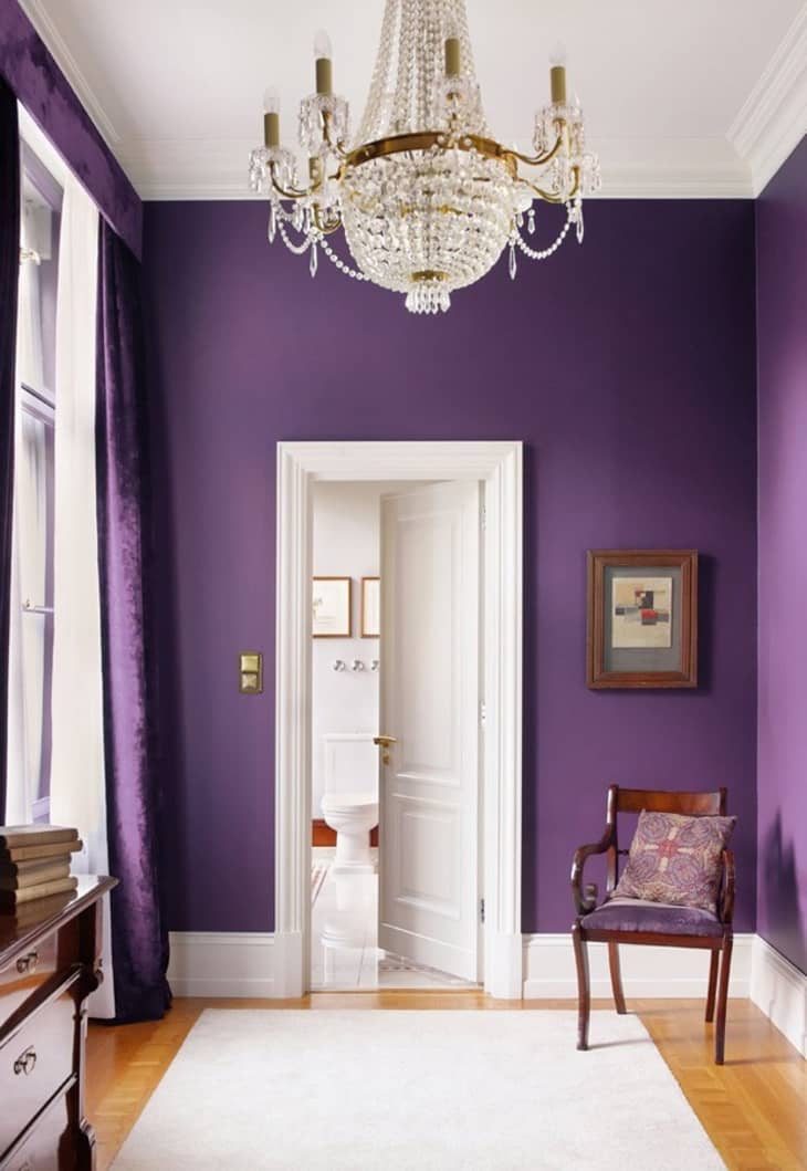
This deep, classic purple, seen in a room fromCasa Vogue, is definitelya lot(especially when paired with those velvet curtains). While I understand that this room may not be for all tastes, it gets a thumbs-up from me for creating a color experience that’s committed, immersive, and yet somehow not cartoonish. Less princess, more queen.
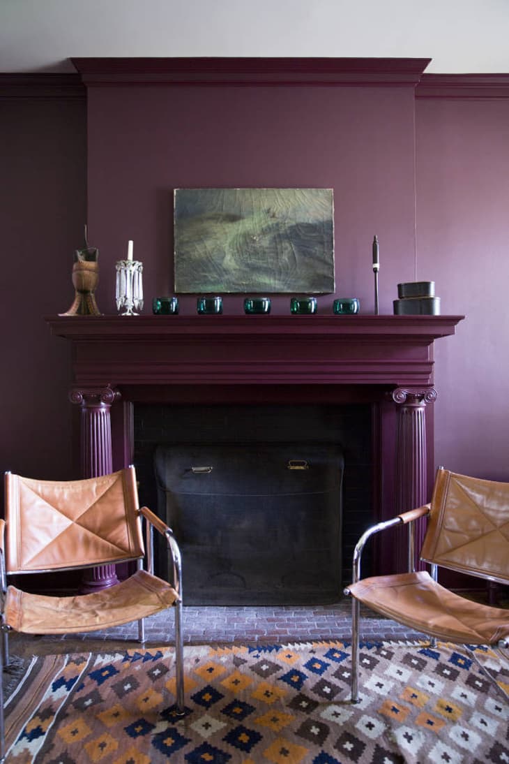
There’s crayon-box purple and then there’s plum, oraubergine,or whatever you prefer to call it — a deep (and a bit reddish) shade of purple that somehow reads a bit more grown-up than its bluer counterparts. When it fills a whole room, as in this space fromDomino, it’s still quite a strong statement, but it’s a bit more nutty professor (in a good way) than grown-up Barbie. It also, unexpectedly, coordinates well with caramel-toned leather.
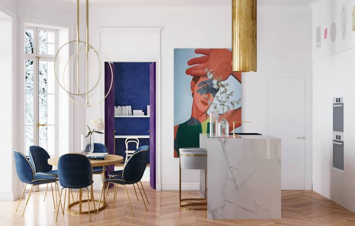
Pink, purple, and gold are as princessy a combo as you can get — but in this Paris apartment byCrosby Studios(also seen at the lead of this post), they come together in a minimal and even modern way.
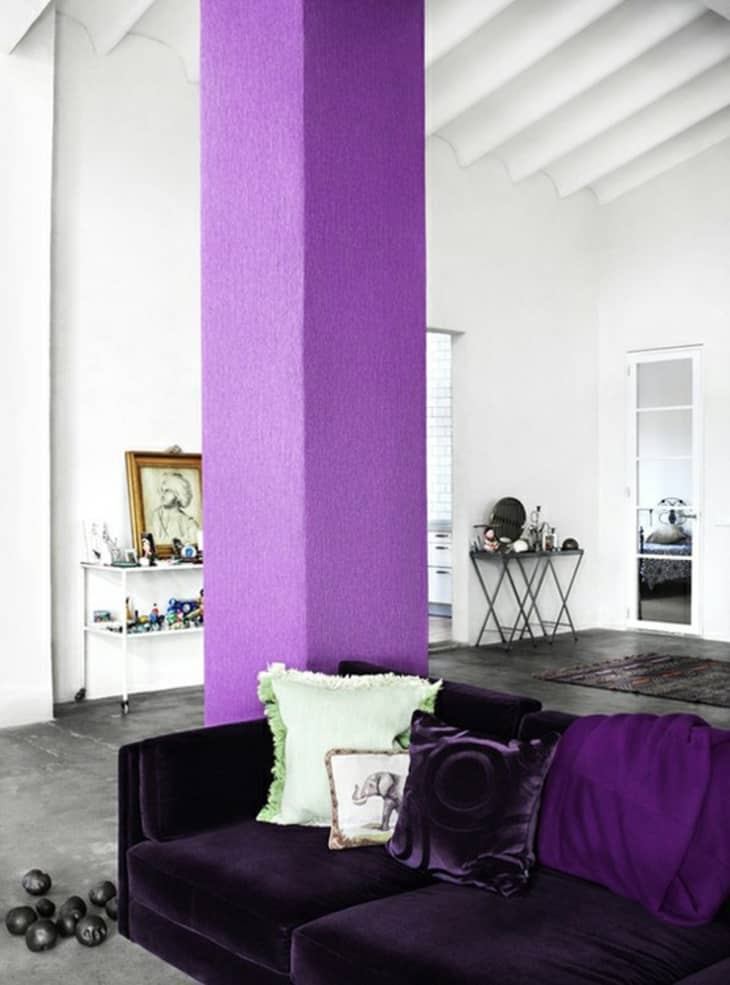
If your tastes tend more toward the bluer, dreamier end of the purple spectrum, there’s still hope. The column in this room fromPelle Bergstrom, via Apartment Therapy, is distinctly highlighter-colored, but the white of the surrounding room (and the more staid deep purple of the neighboring sofa) balances it neatly.
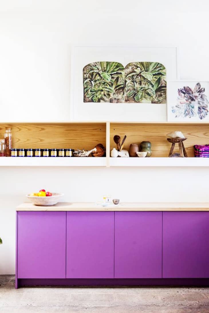
Purple in a kitchen might seem odd or garish, until you see this kitchen fromMy Domaine, which unexpectedly seems just right. The wood countertop and shelving really balances out the jolt of color.
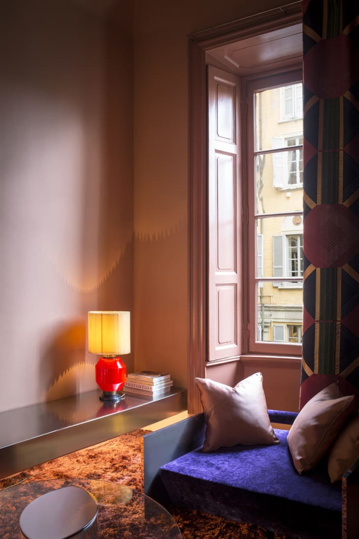
You might not think it, but Ultra Violet, a very bold color, and dusty pink, which tends to be a bit retiring, can be a very nice combo, as seen in this composition fromDimore Gallery. The key: keep the bolder color as the accent.
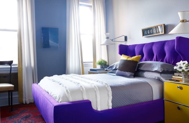
That same thinking prevails in this room byWesley Moon, where a very boldly colored purple bed makes a great impact, but doesn’t overwhelm the space, thanks to the light blue background.
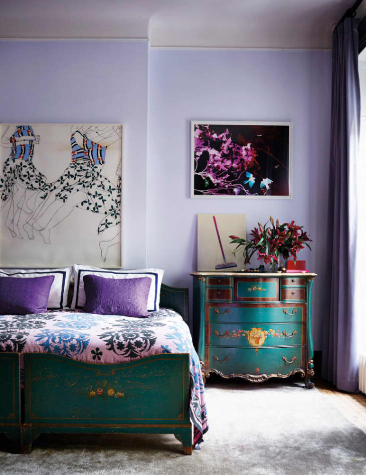
Layering purples on purples creates a whole suite of new possibilities. Deep purple accents paired with lavender walls, in this space fromDomino, feel eclectic and original.
Purple creates a backdrop for a really quite sophisticated room in this image fromDomino. The takeaway? A deep purple like this is always going to be a bold statement, so limit the other colors used to neutrals.
I think plum really comes to fruition in this room fromElle Decoration, paired with a rich marine blue. It’s an unexpected but really lovely combination, and also proof that purple has a lot of sides, and can be very sophisticated and surprising. Look, you may still not love it — but that’s okay. There’s a unique richness to purple, and one that can, in the right circumstances, really shine.
