

Your Curtains Don’t Always Have to Match, and This Living Room Proves It
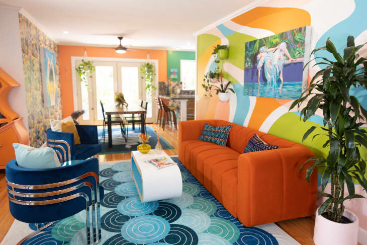

When making decorating decisions for your home, rather than asking yourself, “How does this look?” have you ever asked yourself, “How does this make mefeel?” When artist莎拉Steiberbegan decoratingher San Diego home, her intent was to create a space reflective of her personality and own original artwork. Using words like “joyful” and “quirky” to describe both her art and personal aesthetic, she wanted to create an atmosphere that conjured those same vibrant expressions. On a mission to create exuberance in her surroundings, she and her husband, Chris, didn’t really concern themselves with whether things matched or patterns clashed.Prioritizing the vibe of her space led Steiber to a few unique decorating ideas, particularly with curtains and other textiles, and her living room is where one such decorating tip — using mismatched ombré curtains — really shines.
For more content like this follow
In order to create the fun and joyful feeling she was seeking forher home, Steiber knew she’d need to pile on the bright, saturated shades. “Bringing color into our space was such a priority for me that I began painting the mural in the living room before I even unpacked my clothes!” she recalls inher house tour. If you, like Steiber, are eager to inject some joy, fun, and energy into your home, adding bold colors can be a great place to start. However, if you aren’t an artist and can’t paint your own wall murals, don’t worry. Steiber’s home is full of other rainbow-inspired ideas that require no artistic abilities. Case in point: the aforementioned, mismatched, primary-colored curtains that create an ombré effect in her living room.

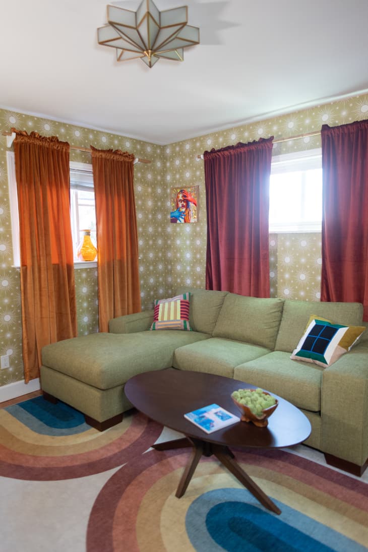
“I’m such a colorist at heart… Years of painting with a palette of 30 paint colors at a time makes it impossible for me to choose just one,” she says — and so she didn’t, even with textiles that conventionally tend to be matching! Specifically, each of the three windows in her living room are donned with a different set of brightly-colored, warm-toned curtains: yellow, orange, and red. This creative choice adds a lot more color (and thus, more joy!) to the rainbow-themed living room, but because the curtain panel type (i.e. the texture, material, style)stays constant,the overall look doesn’t end up appearingtooeclectic.
Even if maximalism isn’t your style, you can still implement this idea in your home by choosing pastel shades for a more muted but still high-impact, multi-colored look. I could see this idea working well in a kid’s room or nursery, especially with pastel hues in particular. Another thing to consider is how changing your curtain fabric can influence the overall aesthetic of this kind of installation; choosing rainbow-hued sheers would result in a lightened-up version of Steiber’s saturated living room. You could also try this idea to cover glass sliding doors, with the rainbow panels hanging side by side to create a real ROYGBIV progression at night or when you don’t want the sun shining in.
If you’re still feeling a bit overwhelmed at the prospect of addingsomuch color to your space, consider this thought from Steiber herself: “I believe that the depth and richness of a space stems from multiple colors dancing together, and it’s absolutely possible to create a color symphony and still make it feel cohesive!” she says.